Typography is one of the most crucial components in any graphic design. This is true for logo design, web design, poster design, and so many others.
The element shapes how well your audience can understand and absorb your message. It can make or break your design, so it's essential to know how to use the two types of fonts and choose the best one for your brand.
This article tackles the two standard fonts, which are serif and sans serif fonts. We will teach how you can use them to your advantage and strengthen your brand further. With a better understanding of this design element, you're equipped with the knowledge to carry out better text designs and carry out creative typography concepts effectively.
Why fonts matter
The way you present whatever text your design helps build an impression among your audience. It doesn't matter if it's your brand name or product description. Your fonts can transform your text into something that people will remember.
Here are some of the ways that fonts impact your design and brand image.
- It is another form of visual expression that can embody whatever emotions and thoughts you or your brand may have.
- Text design helps you become more unique, helping you develop a memorable identity.
- Fonts make the text easier to read and more convenient for the audience. Typography is a fundamental component of design.
- It is an element that you can use to improve the experience of your audience.
Serif fonts
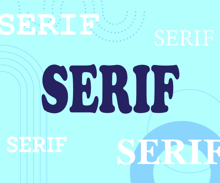
Serif has got to be one of the most popular typography terms out there. It comes from the Dutch word "schreef," which translates to "marks of the pen." It refers to the mark left by a calligrapher's natural wrist movement that marks their movement with an ornamental line at the end of a stroke.
Research has found that consumers perceive this font to be all-purpose and make brands appear traditional. Vogue, Tiffany & Co. are just some of the brands that use this for their logo. At the same time, news publications like New York Times and The Guardian use this for their articles.
Another perk that comes with using serif fonts is their symmetry. This creates an easy-to-read design, especially for printed materials. It also helps people to read faster as the tail ornament leads their eyes along with the text.
So if you want to appear authoritative and established, this font is for you. Huge bodies of text benefit from being presented in a serif font. When it comes to the serif vs. sans serif readability, serif fonts take the cake for printed purposes. This style is best for printed marketing collateral like brochures, flyers, magazines, and more. Plus, it's great for a statement look on logos as well.
Baskerville, Garamond, and Caslon are a couple of serif font examples you can use for your brand materials today. Libraries online are an excellent place for you to familiarize yourself with more serif font lists and other variations that will go with your design.
Sans serif fonts
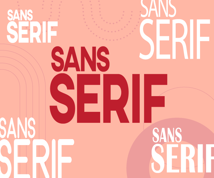
The counterpart of serif fonts is sans serif fonts or letters that do not have ornamental details found on each stroke. The "sans" is a French word for "without" to relay the absence of the tail.
This font grew in popularity around the 1920s during the spur of modernization. The Bauhaus movement helped raise its prominence. It is loved for its simplicity in a time full of highly stylized graphics. During this time, one of the most popular sans serif fonts called Futura was also introduced.
Brands that use sans serif fonts appear more friendly and modern. Consumers perceive this font as an all-purpose font as well. Today, this style is used by Google, Netflix, and other established brands for its identity. While Apple, Microsoft, among many others, use this across their platforms, whether it be packaging or their website.
You might have noticed that tech brands use this font a lot. That's because it is easier to read on digital devices like smartphones or electronic billboards. So when making digital content, be it a TikTok video, digital brochures, or an Instagram post, consider using this style to display your text. Plus, it has a laid-back look that younger audiences take an interest in.
Some of the best sans serif fonts to use are Montserrat, Helvetica, Lato, Oswald, and more. You can explore more options by browsing logo libraries online.
What to consider when picking a font
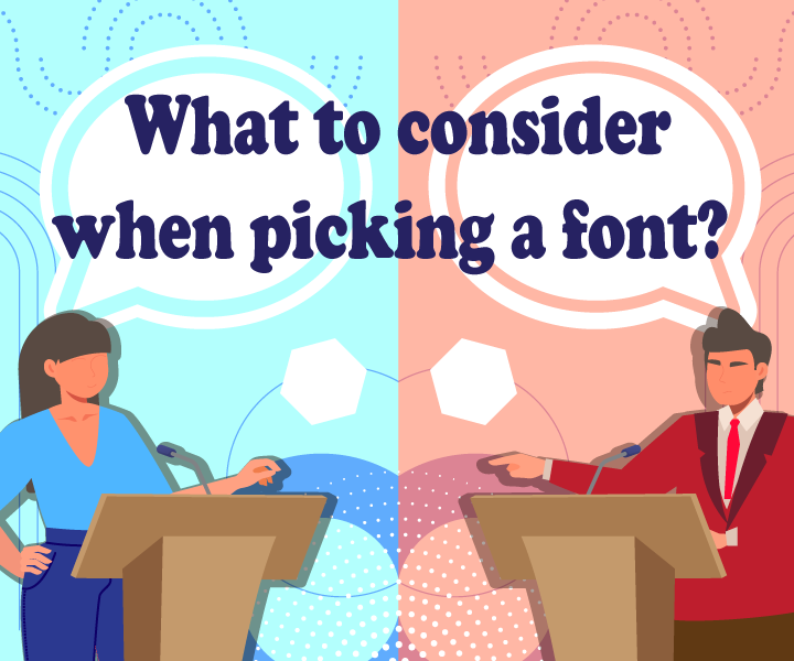
There are a lot of things that come with choosing a font. While you could certainly use a spin wheel roulette to pick your brand's font, considering the following factors will help you create a more structured approach.
Learn how to pick a font for your brand identity guidelines below.
Readability
One of the main complaints of people regarding typography is fonts that are too small and low in contrast. Unoptimized text becomes a hurdle for them as it gives them a more challenging time digesting content. Studies have shown that this factor affects the way people absorb information. Size, line spacing, and the age of your audience are the three critical factors that drive readability.
There are different ways for you to improve readability. For example, you could add more space to the design and make your text easier to read. Setting the text to a more significant point also helps, especially for brands that have an older audience.
Legibility
This aspect is commonly confused with readability. Legibility is all about having distinguishable letters, while readability is more about the arrangement. Similar-looking glyphs like the letters C and O must look clear and hard to confuse with each other.
The "Il1" test (capital letter i, lowercase L, and a number 1) by type designer Jessica Hische is a handy test that you can use to improve the distinction in every letter, especially when it comes to sans serif fonts.
Versatility
Think about the design you are going to create and where you will apply it. For example, when starting a business logo design, you want to ensure that the logo is easy to understand when put on different digital platforms like web design or print materials like a catalog. It will give you an easier time using your design to match whatever campaign you will launch.
Fonts such as FF Scala and Garamond, among others, are great examples of fonts. The mentioned font offers all-around designs that don't compromise style. But you can also search through other font libraries to broaden your options.
Consistent with your brand identity
A practical font choice goes beyond functionality. It must also do its part to relay your brand's identity to the audience and make you more recognizable from your competitors. For example, if you run a skateboarding shop, you could incorporate urban-inspired concepts like graffiti logo or stencil typography brand mark to make your brand more recognizable.
Make sure you take time to determine what personality you want your brand to have. For this process, it is crucial to consider your target audience and consider traits that will best resonate with them.
Variation
When picking more than two fonts, you want to make sure that you don't select similar-looking ones. Otherwise, you may create a design that is too samey, and It is best to pick two distinct styles and build a strong contrast. In addition, not having a good font pairing may make your message hard to read and result in a lack of distinction among the headline, subsection, and body.
Adding styles like bold or italic will create a noticeable design, creating a more appealing look. One go-to trick for designers is to look for a chunky and lightweight font to create an eye-catching combination.
Conclusion
Now that you've learned the difference between each typeface, you're ready to make informed decisions for your brand. It is another asset that you can use to connect with your audience.
Incorporate the right text design lets you achieve your vision for any project. Ensure that you have a well-rounded design with stunning typography, colors, and other design elements by exploring the options below.
Starting a design contest for projects like logo design or business card design is one way to source different options from a diverse group of people. DesignCrowd is a platform that you can use to work with freelance graphic designers who can submit up to 50 original designs for you to choose from. Try it right here.
You can even apply what you've learned from this article by taking the DIY route. Taking matters into your own hands is easy with the BrandCrowd logo maker. It lets you create logos, business cards, and other marketing collateral by letting you personalize its collection of professionally crafted designs. Try it right here.
Read more articles on design and inspiration below:
Written by DesignCrowd on Wednesday, June 16, 2021
DesignCrowd is an online marketplace providing logo, website, print and graphic design services by providing access to freelance graphic designers and design studios around the world.
