A logo needs to make an instant impact in a visually crowded world. Flat logo design delivers just that. With bold colors, crisp lines, and simple shapes, flat logos are easy to spot and hard to forget.
And what’s exciting is that this style is no longer reserved for design professionals. Thanks to user-friendly platforms and logo makers, anyone can easily create a striking flat logo.
As flat logo design continues to gain popularity in 2025, its appeal lies in clarity and simplicity — qualities that help brands cut through the noise. Let's look closer at why flat logos remain so effective, the latest trends, and how brands use this timeless style to connect with audiences.
What Is a Flat Logo?
Flat logos keep things simple and direct. It uses two-dimensional shapes, bold colors, and crisp lines without gradients, shadows, or fancy effects. The result is a clear, modern, and instantly recognizable logo.
Flat design became popular as screens improved and digital life took over. Early digital logos often leaned into skeuomorphism, a style where designs looked like real objects, with textures and shadows. But as technology evolved, designers switched to more straightforward, cleaner looks.
Big names like Microsoft, Apple, and Google led the way by moving to flat design in their operating systems, making logos easier to read and quicker to load.
Core principles of flat logo design
- Simplicity: Flat logos focus only on essential elements, leaving out unnecessary details or decorative extras. This stripped-down approach keeps the design clean and allows the brand’s core message to shine.
- Bold colors and clean lines: Strong, vibrant colors paired with crisp, defined edges make flat logos stand out. These choices help the logo maintain its impact across different backgrounds and uses.
- Scalability: One of the standout features of flat design is its adaptability. Because these logos avoid complex effects, they stay sharp and legible at any size, from small app icons to sizeable outdoor signage.
- Clarity: Flat logos' straightforward nature makes them easy to recognize and understand. Clear and uncomplicated designs help viewers quickly connect the logo to the brand it represents.
- Consistency: A flat logo should always reflect the brand’s personality and values. Consistent use of shapes, colors, and style across all platforms builds trust and reinforces brand recognition.
Notable Flat Logo Designs in 2025
Several established and new brands effectively utilize flat design principles in their latest logos. Here are some of them:
Corporate rebrands
Many established corporations opt for flat design to appear more modern and approachable in their rebranding efforts. These are some examples:
Lego
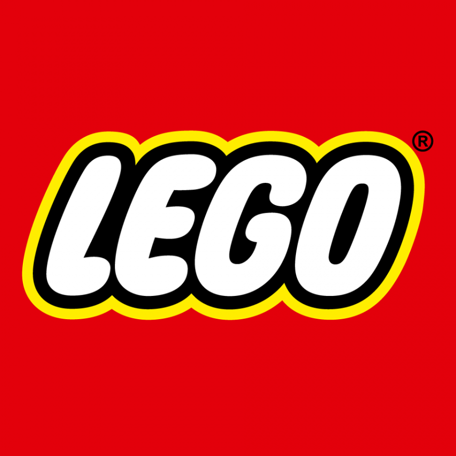
Lego’s new flat logo features hand-drawn touches and bright colors, capturing creativity and playfulness. The design works perfectly across digital and print, staying vibrant and recognizable at any size.
Hostess
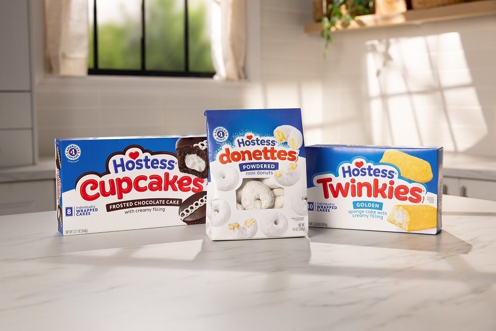
The iconic snack brand recently refreshed its look with a playful, bubble-style font and a brighter color palette. The flat design keeps things modern while retaining the brand’s nostalgic charm. Plus, the new rebrand makes Hostess easy to spot on shelves and online.
Kleenex
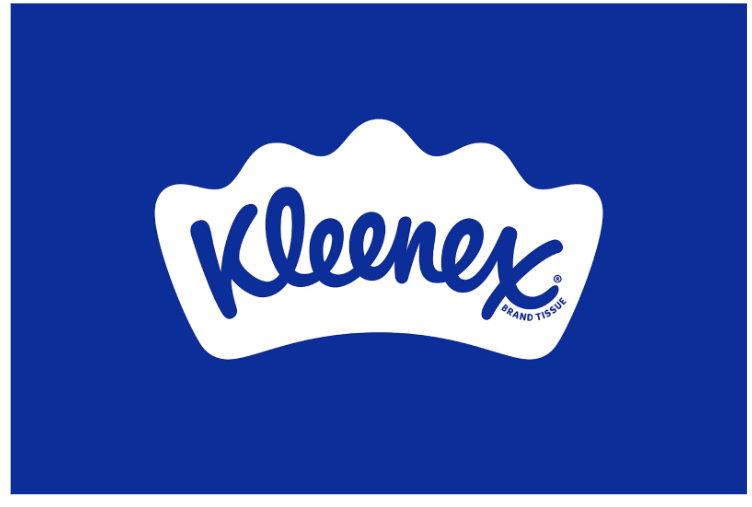
Kleenex also recently introduced an arched, slanted logo that adds movement and personality. This approach modernizes the brand's image while maintaining its recognizable identity. The flat, clean lines ensure the logo remains crisp and clear across all product lines and marketing materials.
Startups and tech companies
Flat design naturally aligns with the aesthetics of many startups and tech companies that aim to project innovation and user-friendliness. Some examples of them are:
Zapier
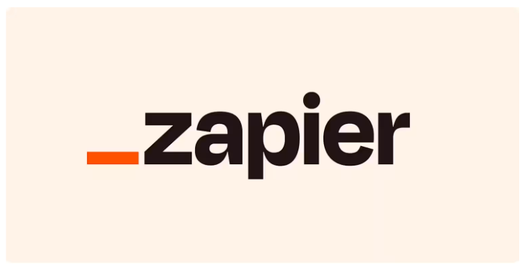
The automation platform’s new logo uses bold, custom typography called Degular for a fun, approachable feel. The flat design keeps it simple and memorable, perfect for today’s busy tech world.
Hootsuite
Hootsuite's refreshed logo features a simplified owl icon and clean typography. The flat style makes it look modern and user-friendly while maintaining its sharpness and consistency across all digital platforms and devices.
Why Flat Logos Still Rule in 2025
Flat logos remain a top choice for several reasons. Here are the main ones:
- Easy to recognize: Flat logos are instantly identifiable thanks to their simplicity. Viewers can spot and remember them at a glance, which is crucial in crowded online spaces.
- Versatile: Flat logos adapt seamlessly to any format. Whether printed on business cards, splashed across billboards, featured on websites, or displayed on product packaging, their clean design ensures they always look sharp and professional.
- Modern feel: The uncluttered look of flat design fits perfectly with today’s design trends. Brands using flat logos come across as fresh, current, and approachable, appealing to modern audiences.
- Fast loading: Flat logos have fewer details and no heavy effects, keeping file sizes small. This means websites and apps load faster, improving the user experience and making digital content more efficient.
- Memorable: Simple shapes and bold colors make flat logos stick in people’s minds. The straightforward design helps audiences associate the logo with the brand, boosting recognition and recall.
Top Flat Logo Design Trends in 2025
Flat logo design is always evolving, combining classic simplicity with fresh, creative twists. In 2025, designers are pushing the boundaries of flat logos, introducing new techniques and ideas that keep this style both modern and memorable.
Here are some of the standout trends shaping flat logo design this year:
Minimalism with a twist
Designers are moving beyond pure minimalism by adding subtle gradients or gentle textures to flat logos. These touches create a sense of depth and sophistication, all while keeping the overall look clean and uncluttered.
For example, a logo might feature a soft gradient in a single color to add dimension, or a faint, uniform texture to give a tactile feel without overwhelming the design.
Discover how minimalist logos can be elevated with subtle details in the examples below:
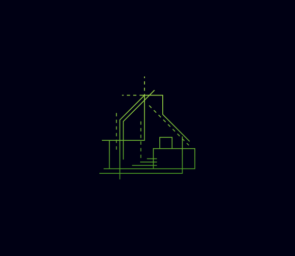
Minimalist Architect Blueprint by Design

Minimalist Coffee Grinder by Design
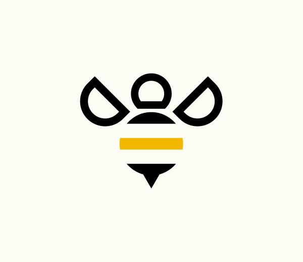
Minimalist Bee Insect by Design
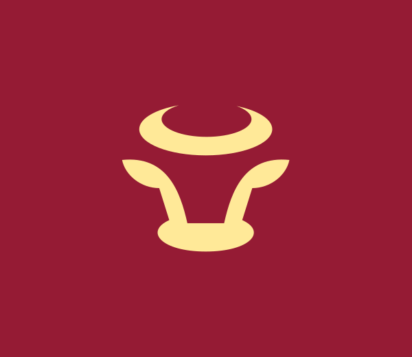
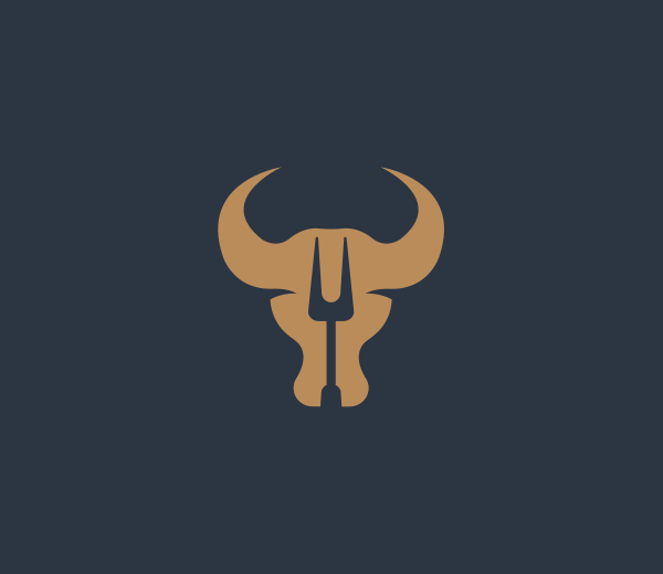
Minimalist Bull Horns by Design
Geometric Minimalist Buffalo by Design
Geometric and abstract forms
Simple shapes like circles, triangles, and squares are being combined in creative, abstract ways. These bold and flexible geometric logos allow brands to convey different meanings and adapt across various platforms.
Take a look at how brands can use geometric shapes and abstract forms to craft memorable flat logos:
Simple Geometric Shape by BrandCrowd
Geometric Diamond Business by BrandCrowd
Modern Geometric Shield by BrandCrowd
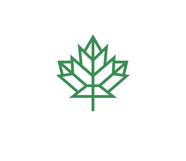
Geometric Maple Leaf by BrandCrowd
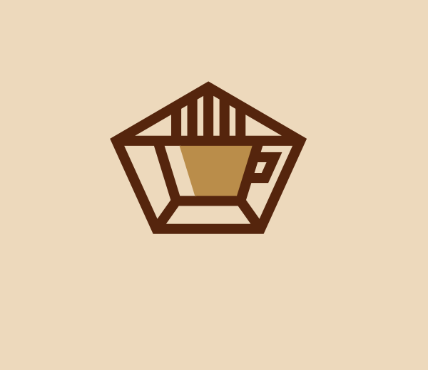
Geometric Coffee Cup by BrandCrowd
Bold typography
Typography is taking center stage in flat logo design. Custom, sans-serif fonts give logos a unique voice and strong presence. Sometimes the logo is just the brand name in a striking font. Other times, a bold type supports a simple icon.
Explore these standout flat logos where bold, custom typography takes the spotlight:
Alphabet Modern Business by Design
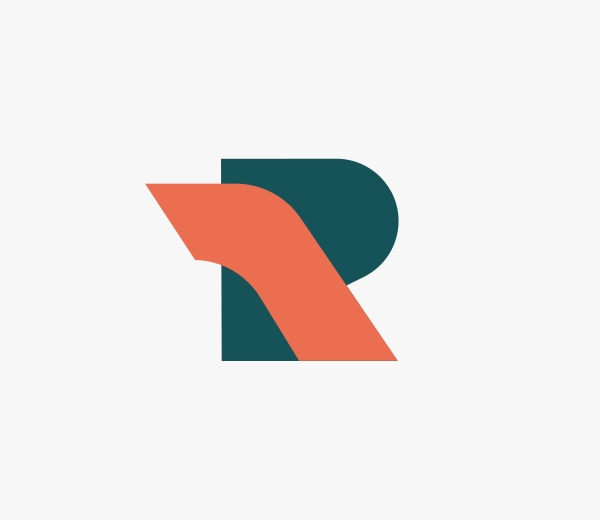
Alphabet Speed Letter R by Design
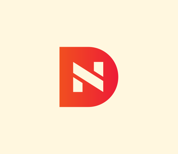
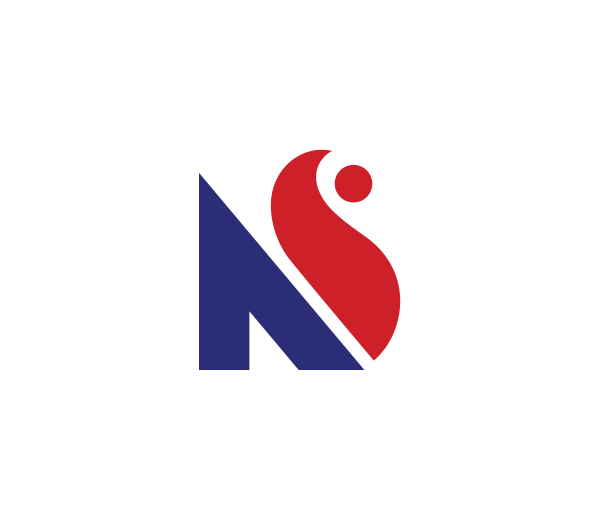
Alphabet Property Letter ND by Design
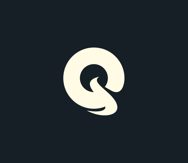
Stylish Brand Cursive Letter Q by Design
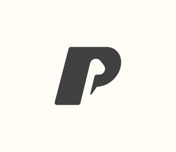
Studio Brand Letter P by Design
Monochromatic and limited color palettes
Many brands use a single color or a tightly controlled palette for their logos. Monochromatic logos feel sleek and elegant, while limited color schemes highlight a brand’s personality without overwhelming the design.
Want to see more monochromatic logos? Get inspired with some designs below:
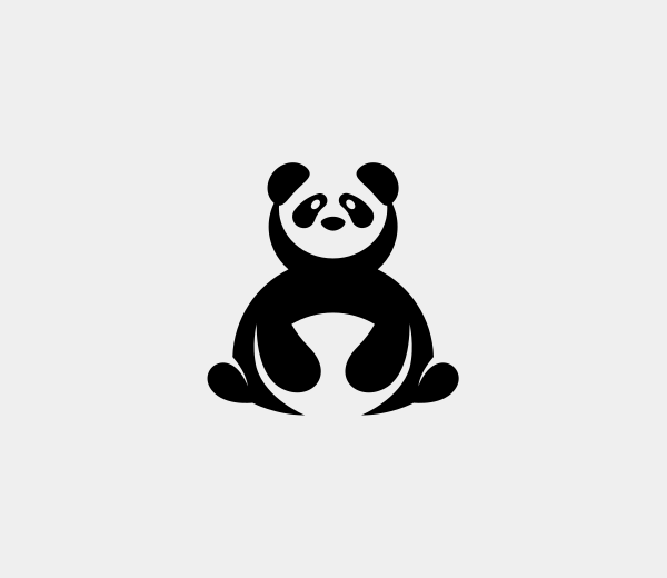
Wild Panda Bear by Design
Triangle Shape Business by Design
Bow Tie Castle by Design

Yellow Cracked Target by Design
Royal Crown King by Design
Integration of negative space
Clever use of negative space is making logos more engaging and memorable. Designers are finding creative ways to hide extra meanings or images within the spaces of a logo, adding an element of surprise and encouraging viewers to look closer.
See how negative space adds visual intrigue in the following examples:
Negative Space Necktie Column by BrandCrowd
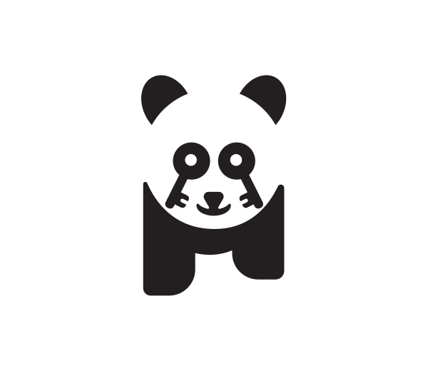
Key Lock Panda by BrandCrowd

Employee Suitcase Necktie by BrandCrowd
Bull Steak House by BrandCrowd
Pig Animal Farm by BrandCrowd
Designing Your Own Flat Logo
Want to create a flat logo that stands out? Here’s how to get started:
Key considerations
- Know your brand: Define your brand’s values, mission, and personality. Your logo should capture what makes your brand unique and connect with your target audience.
- Choose the right colors and fonts: Pick a color palette that reflects your brand’s character and is easy on the eyes. Pair it with a clean, readable font to ensure your logo remains clear and compelling.
- Keep it simple: Focus on the essentials. Avoid unnecessary details or effects that could clutter your design and dilute your message.
- Test for scalability: Make sure your logo looks sharp and recognizable at any size, whether it’s a tiny app icon or a large billboard.
Tools and resources
There are plenty of tools and platforms to help you bring your flat logo ideas to life. Some of them are:
- Design software: Adobe Illustrator remains the industry standard for creating scalable, vector-based logos, perfect for flat design.
- Online platforms: Websites like Design.com and BrandCrowd offer easy-to-use interfaces and a variety of design tools, making it possible to create professional flat logos even without prior design experience. If you want expert help, consider working with a designer on DesignCrowd.
- Inspiration sources: Browse platforms like Dribbble and Behance to discover current trends and gather inspiration from top designers around the world.
Common mistakes to avoid
- Adding too many elements: Overcomplicating your logo can undermine its clean, modern look. Stick to what’s essential.
- Ignoring scalability: Your logo should be versatile and maintain its clarity, whether displayed large or small.
- Forgetting brand alignment: Make sure your logo stays true to your brand’s identity and messaging for a consistent look across all platforms.
The Power of Flat Logo Design
Flat logo design remains an innovative and effective choice for brands in 2025. From established companies updating their image to startups launching their first identity, flat design offers a reliable foundation for building a strong, memorable brand.
If you’re ready to put these ideas into action, there are great tools to help you get started. DesignCrowd offers access to a community of skilled designers who can bring your flat logo vision to life. For those who prefer a hands-on approach, Design.com’s AI logo generator provides an intuitive platform to create a logo that fits your brand.
Flat design is all about impact. Keep it simple, keep it bold, and let your brand shine.
Hannah Suroy suroy loves turning big stories into easy-to-digest articles about movies, TV, business, and more. These days, she mainly writes creative articles and insights focused on the world of design.
Header Artwork by Khim John Blazo
Read more on designs here:
Written by DesignCrowd on Wednesday, May 14, 2025
DesignCrowd is an online marketplace providing logo, website, print and graphic design services by providing access to freelance graphic designers and design studios around the world.
