A few logos have stood the test of time in a world where companies constantly change their look. Every day, we see brands change their visual identity, often discarding years of brand recognition.
Yet, a few logos in various industries show the power of simple and classic design. They prove that a good logo design can build strong customer connections for many generations.
This article will explore ten of the oldest logos still in use today. Each one is an excellent example of how to create a lasting design. They offer valuable lessons for modern brands that want to build a visual identity that can last generations.
Why Logo Design Longevity Matters
When a logo lasts decades or centuries, it becomes more than just a picture. It becomes a symbol of trust and reliability that customers can count on. It shows that the brand is strong and committed to quality.
The effect of a long-lasting logo on people is huge. Over time, consumers feel an emotional connection to these symbols. This creates deep feelings that affect what they buy and their loyalty to a brand over many generations.
Building trust through consistency
A consistent look becomes a simple way to show reliability, quality, and authenticity. Customers learn to connect a familiar design with trustworthiness. This creates powerful feelings that lead to brand loyalty and word-of-mouth recommendations.
When people see the same basic design year after year, they see it as dependable and proven. This visual stability is a significant advantage that newer brands cannot get overnight, no matter how much they spend on marketing.
Rarity of unchanged logos
In a market of frequent redesigns, logos that keep their main elements are special. While most brands follow the latest design trends, constantly updating their look to appear modern, these examples of timeless branding keep their core identity. They only make small, careful changes.
Keeping these main elements creates a sense of quality and confidence. When everything else changes, brands that hold onto their core visual identity seem more confident, established, and worthy of long-term trust.
Heritage as a brand asset
Logos that are centuries old show heritage, authority, and a proven track record that money can't buy. They tell customers that a company has been around long enough to perfect its craft, survive many economic cycles, and earn the trust of countless people.
In a time when consumers highly value authenticity, these historic logos serve as proof of genuine heritage. They are not just manufactured nostalgia or borrowed ideas from other brands. They represent a genuine historic logo design that has earned trust for decades.
10 of the World’s Oldest Logos Still in Use Today
These historic brands prove that great design truly stands the test of time. Each logo has survived wars, economic crashes, and countless design trends while keeping its core identity.
The stories behind these designs reveal a few common ideas: meaningful symbols, careful changes, and the wisdom to keep what works.
1. Stella Artois (Since 1366)
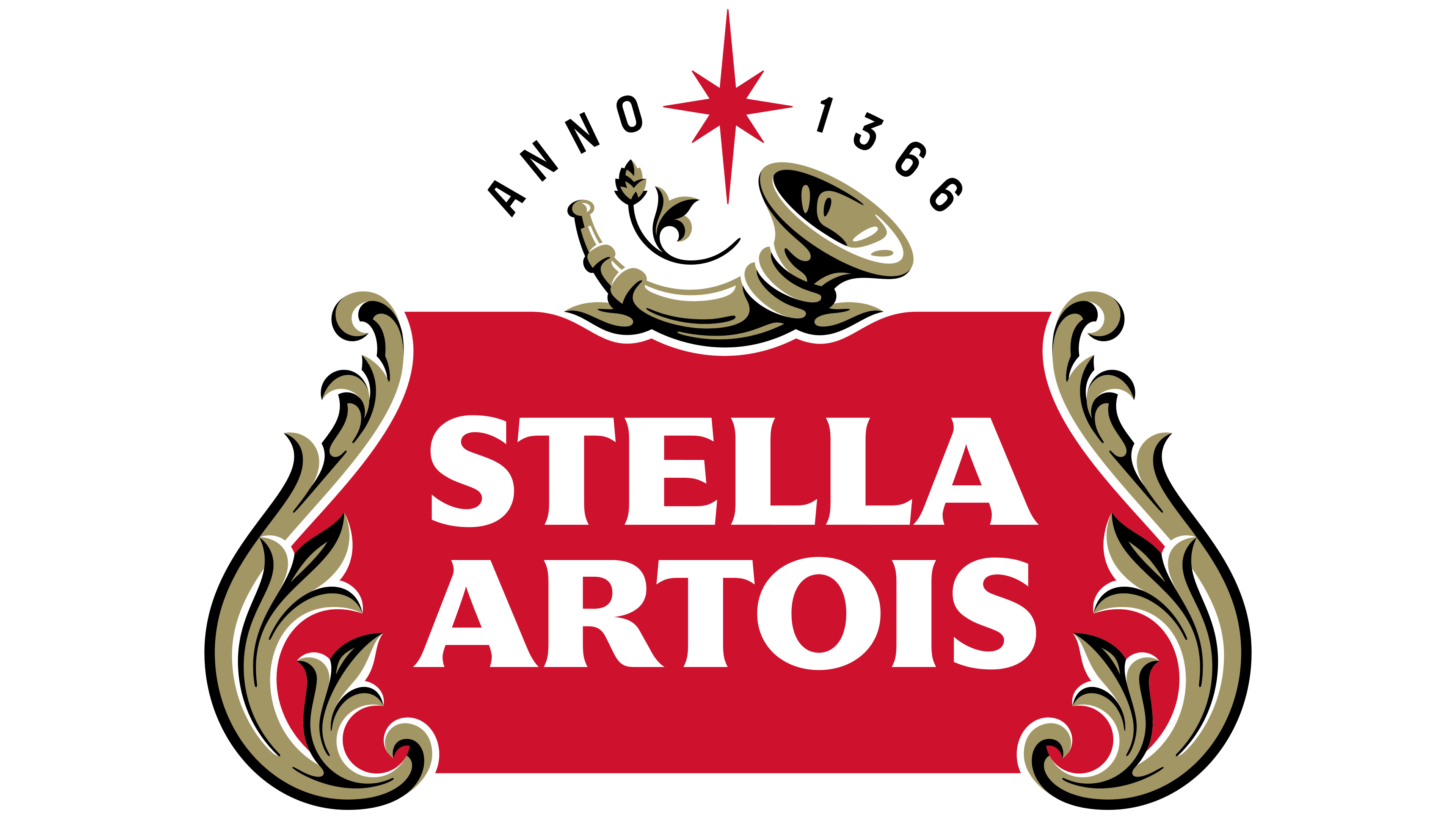
Stella Artois is a Belgian brewery with a very long history. While the company we know today was founded in 1708, its brewing roots date back to a brewery in Leuven, Belgium, in 1366.
The brand's logo has a horn symbol, which comes from the city of Leuven's coat of arms. The star in the logo refers to the "Stella" part of the name, which means "star" in Latin. The logo's core symbols have stayed the same for centuries, connecting the brand to its proud brewing heritage.
2. Twinings (Since 1787)
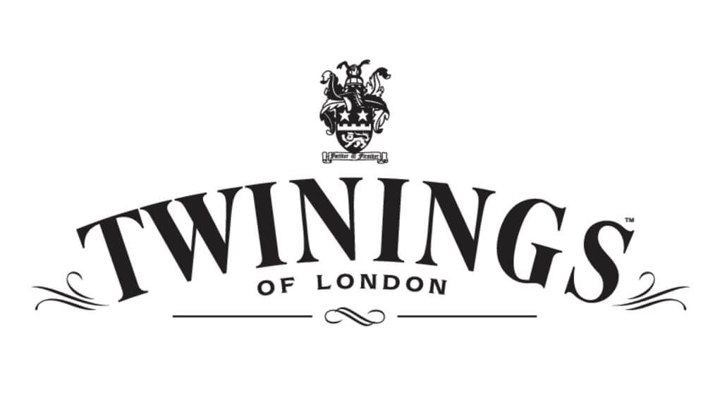
Twinings is Britain's oldest tea company and one of the world's most well-known tea brands. Founded in 1706 by Thomas Twining, the company created its iconic logo in 1787. This makes it the world's oldest logo that is still in continuous use.
The design has a golden lion crest above the elegant Twinings name. While minor changes have been made over the years, the main parts have been the same for more than 235 years. The lion represents British strength and royal heritage, showing the company's long relationship with the British monarchy.
3. Nestlé (Since 1868)
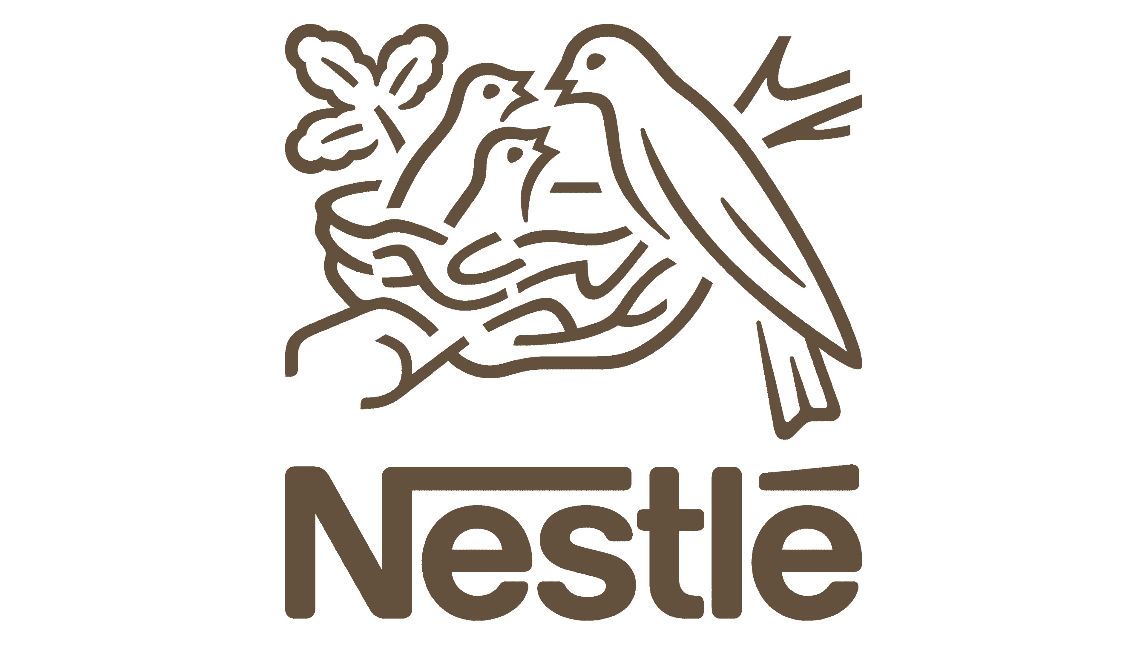
Nestlé is a global food and beverage company. Its first logo was introduced in 1868 by its founder, Henri Nestlé. The logo shows a bird's nest with a mother bird feeding her young.
Nestlé chose this symbol because his family name means "nest" in German. He thought the image of a nest would connect with consumers by showing feelings of care, safety, and nourishment. The basic design of the nest and birds has been used for more than 150 years.
4. Heinz (Since 1869)
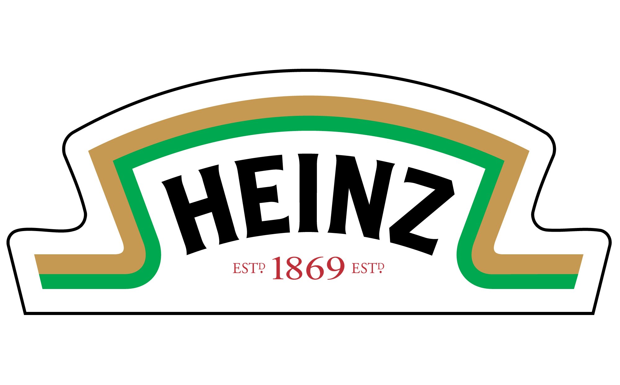
Heinz is an American food company known for its condiments. The company's famous keystone logo was first used in 1869. The keystone shape was chosen to honor the brand's home state of Pennsylvania, which is known as the "Keystone State."
The logo has been updated with different fonts and colors over the years, but the main keystone symbol has stayed the same. Heinz’s logo exemplifies how a brand can evolve while keeping its core identity.
5. Amstel Bier (Since 1870)
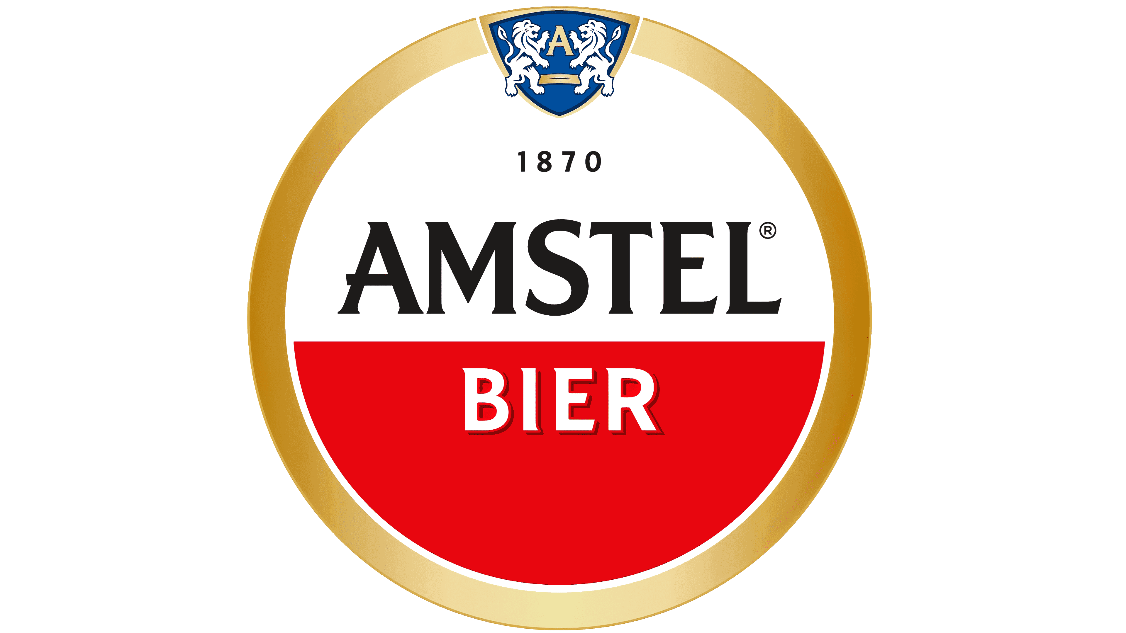
Amstel Bier is a Dutch beer company. It was founded in Amsterdam in 1870 by Charles de Pesters and Johannes van Marwijk Kooy.
The company's logo features two lions standing on their back legs, representing strength and power. This design was inspired by the coat of arms of Amsterdam, where the brewery was founded.
6. Mitsubishi (Since 1873)

Mitsubishi is a large industrial company that works in cars, heavy industries, and financial services. Founded by Yataro Iwasaki in 1873, the company began as a shipping business.
Mitsubishi’s "Three Diamonds" logo was created in 1873. The design combines two family crests: the Iwasaki family's three-diamond crest and the Tosa Clan's three-leaf crest.
The three red diamonds in a triangle shape symbolize reliability, integrity, and success. The name "Mitsubishi" itself translates to "three diamonds" in Japanese. This direct link between the company's name and visual symbol has lasted 150 years.
7. Bass Brewery (Since 1876)
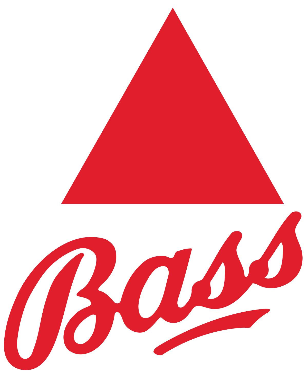
Bass Brewery is a beer company and has a unique place in trademark history. It owns the first registered trademark in Britain. Founded in 1777, the company registered its famous red triangle logo in 1876.
This simple design has a bold red triangle with the word "Bass" below it. The triangle represents stability and strength, and the red color was chosen to stand out.
8. John Deere (Since 1876)
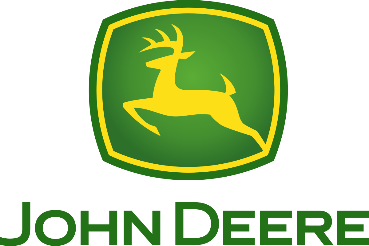
John Deere is a company that makes farm and construction equipment. The company's famous leaping deer logo first appeared in 1876. The design was inspired by a deer on a tombstone in a family cemetery.
Over the years, the deer has been shown in various styles, from realistic to more modern and simple. However, the core idea of a leaping deer has always been present. This is a clear example of successful logo evolution.
9. American Red Cross (Since 1881)
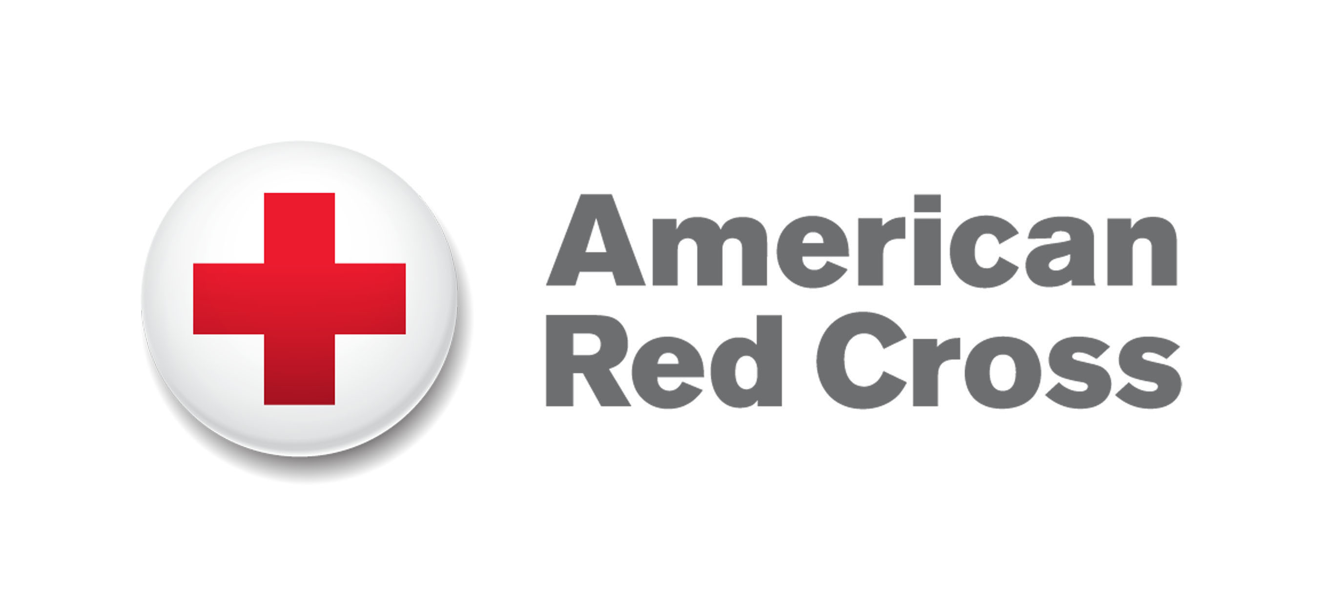
The American Red Cross is a humanitarian organization that provides disaster relief. It was founded in 1881 by Clara Barton.
The brand's main logo is the red cross symbol on a white background. This symbol comes from the first Geneva Convention, which was created in 1864 as a sign of neutrality and medical care.
The American Red Cross has used this powerful, meaningful, and simple logo since its founding. Its consistent use shows the power of a symbol that means hope and help to people worldwide.
10. Boots (Since 1883)
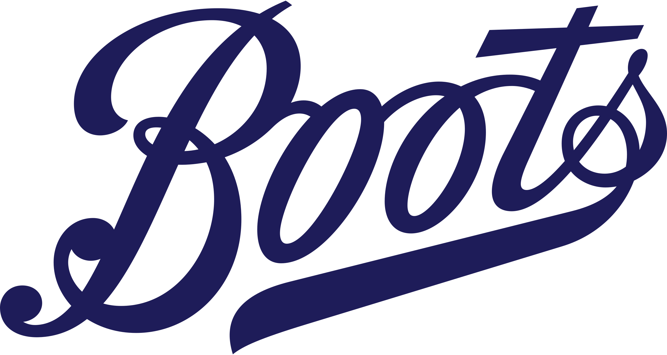
Boots is a well-known health and beauty retailer in the United Kingdom. The company was founded by John Boot in 1849. Its logo has undergone many changes, from a more complex coat of arms to its current simple wordmark.
The famous Boots logo first appeared in the late 1880s. Over time, it has become much simpler and modern. This long history shows how a company can adapt its visual identity while staying true to its name.
Key Characteristics of the Oldest Logos
These long-lasting designs share common traits that have helped them survive changing times. Understanding these traits shows us why some designs last while others disappear.
Iconic symbolism
The most lasting logos use symbols that relate directly to the company's story or values. They have meaning beyond cultural differences and temporary trends, creating lasting emotional connections with people.
Get inspired by these symbol logos:
Alpha Latin Symbol by Design.com
Greek Pi Symbol by BrandCrowd
Outline Asian Symbol by Design.com
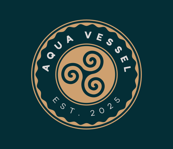
Treskel Sign Symbol by BrandCrowd
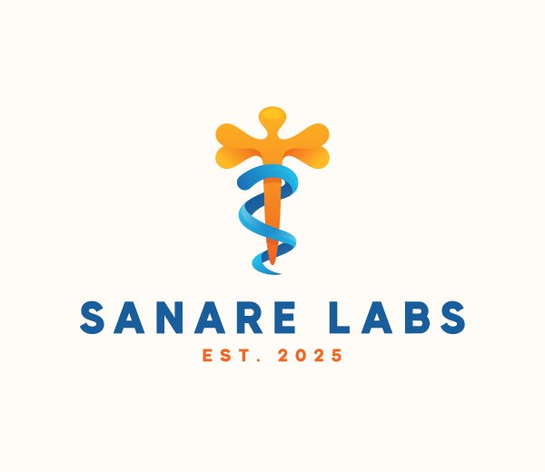
Healthcare Medical Symbol by Design.com
Simplicity and scalability
The main parts of these logos are simple, precise shapes and symbols that work well at any size. Complex details may be added or removed over time, but the core elements remain easily recognizable.
Find your simple logo here:
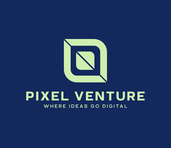
Digital Venture Software by BrandCrowd
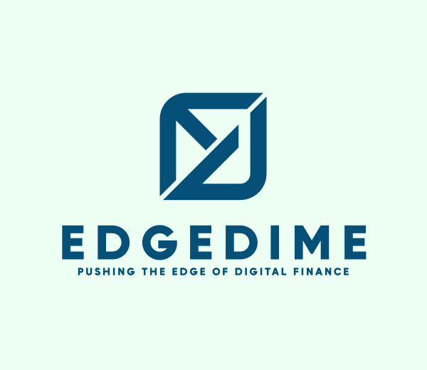
Financial Tech Letter ED by Design.com
Modern Learning Center by BrandCrowd
Modern Sun Ray by Design.com
Simple Modern Studio by BrandCrowd
Subtle evolution, not overhaul
Brands with lasting core elements know slow change is better than a complete overhaul. They keep their primary visual identity while updating fonts and colors to stay modern. This approach keeps customers familiar with the brand while ensuring the design stays fresh.
What Modern Brands Can Learn
Today's designers can study these approaches to create timeless branding that will last generations. The lessons from these historic designs are as true today as they were centuries ago.
Find your core visual identity
Choose one or two main elements that will define your brand for decades. Ask yourself which symbols or designs represent your company's story or values. Then, commit to keeping these through all future changes.
Design for flexible change
Create core elements that can work in new ways. Build your main visual parts to be simple enough to adapt to new platforms that don't exist yet. This helps your brand last in an unpredictable future.
Plan for the long term
Think beyond current trends. Design for a brand that will get stronger over decades, not just years. Remember that the most valuable brand assets are built through consistency over time.
The Enduring Power of Timeless Logo Design
The world's oldest logos are a great example of building a lasting brand through wise design choices. These symbols prove that a logo's longevity isn't about never changing. It's about knowing which elements are essential and having the discipline to keep them, while letting other parts evolve.
The lesson for modern brands is clear. Find your main visual elements early on, choose them wisely based on real meaning, and protect them. Focus on timeless shapes, powerful iconography, and subtle refinements rather than following fleeting trends. Your logo should also look good on everything from a business card and website to flyers and posters.
Platforms like DesignCrowd can help you connect with professional designers, while sites like Design.com allow you to create logos yourself. The key is to remember that the most powerful logos are built to stand the test of time, not just to look trendy in a single marketing campaign.
Read more on designs here:
FAQs on the World’s Oldest Logo
Why do some logos last for hundreds of years?
Logos with true longevity share a few key traits. They are built on simple, core symbols that connect directly to a company's story or values. These designs also allow for careful updates to keep them looking fresh without losing their essential identity.
How does a long-lasting logo build customer trust?
A consistent logo becomes a symbol of reliability and proven performance. When people see the same fundamental design year after year, they subconsciously associate that visual stability with dependability and quality, which helps build strong brand loyalty.
What is the world's oldest continuously used logo?
According to the article, the Twinings Tea logo holds this distinction, with its essential design created in 1787. The logo, featuring a golden lion crest, has remained virtually unchanged for over 235 years, proving its lasting power.
Why is thoughtful logo evolution better than a complete redesign?
Thoughtful evolution preserves a brand's essential visual identity, which protects the recognition and trust it has built over many years. A complete redesign can destroy this accumulated brand value, while subtle refinements keep the logo fresh without sacrificing familiarity.
How can a modern company design a logo that will last?
Modern brands can learn from these historic examples by focusing on a few things. First, identify one or two essential visual elements to define your brand. Then, create a design that can be easily updated or simplified over time, which allows for evolution without a complete redesign.
Hannah Suroy suroy brings clarity to complex topics across entertainment, business, and creative industries. She specializes in translating industry trends and innovations into engaging content that helps readers understand the creative process behind the work they love.
Header Image by Khim John Blazo
Written by DesignCrowd on Thursday, August 21, 2025
DesignCrowd is an online marketplace providing logo, website, print and graphic design services by providing access to freelance graphic designers and design studios around the world.
