Highlights
- Design.com generated over 10,000 food logos with the business name and immediately applied several of them to coordinated business and marketing materials.
- Canva initially returned general food-related social templates without the FreshRoute Food name.
- Design.com was better at creating a startup identity from nothing, while Canva remains better suited to teams that already have established brand assets.
- Overall winner for a startup building its first brand: Design.com.
A startup brand kit should do more than hold a logo, several hex codes, and two font names. It should help a new business establish a recognizable identity and carry that identity across everything needed for launch.
That distinction matters when comparing Design.com and Canva. Both platforms can be used to create logos, websites, business cards, social posts, presentations and other visual content. However, they approach the branding process from different directions.
We used the same brief on both platforms: “Create a modern, approachable brand for FreshRoute Food, a food delivery startup that delivers healthy meals made with locally sourced ingredients aimed at busy, urban professionals.” The objective was not just to find the platform with the most features. We wanted to determine which one could take FreshRoute Food from an undeveloped idea to a coordinated, launch-ready identity.
What Did Our Zero-to-Launch Test Measure?
The test focused on the early-stage branding tasks a founder would need to complete before launching:
- Find a suitable logo direction
- Establish a recognizable visual style
- Carry that style across multiple brand assets
- Minimize manual design decisions
- Avoid visual inconsistencies between materials
- Reach a usable result without hiring a designer
We also considered how well the generated assets resisted brand drift. In this context, brand drift occurs when a business card, website, social post, or presentation uses unrelated colors, fonts, imagery, or styling and no longer looks like it belongs to the same company.
|
Test area
|
Design.com
|
Canva
|
|
Prompt allowance
|
No character limit encountered
|
140-character limit
|
|
Generation speed
|
A few seconds
|
Several seconds
|
|
Initial result
|
Logos plus coordinated brand assets
|
Primarily general social templates
|
|
Business name included
|
Yes
|
Not in the initial templates
|
|
Logo variety
|
10,000+ results across 211 pages
|
Smaller selection of general logo templates
|
|
Cross-asset consistency
|
Applied selected identities across multiple formats
|
Initial results varied widely in style
|
|
Best use case
|
Creating a new identity
|
Applying or managing an existing identity
|
Stage One: Could Each Platform Find a Brand Direction?
Design.com and Canva responded to the same business concept very differently.
Design.com started with the identity
Design.com generated logo designs in seconds. The results page contained 10,096 options spread across 211 pages, giving us far more concepts than a founder could realistically review individually.
Volume alone is not useful if the results quickly become irrelevant. However, the selection on the first page included a surprisingly broad range of interpretations of the FreshRoute Food brief.
Here’s a sample of what we got from the first page:
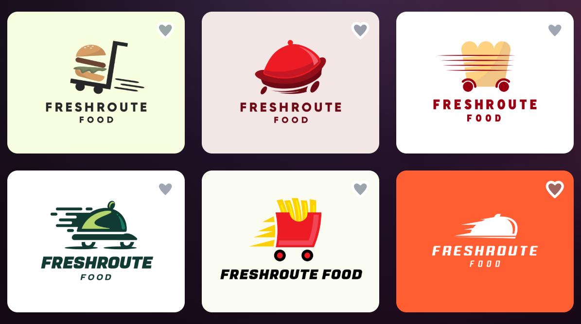
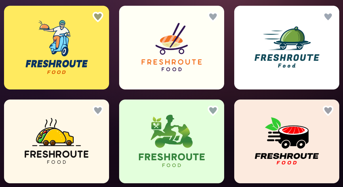
Some logos emphasized delivery through carts, vehicles, motion lines, cloches, and takeaway containers. Others focused on the healthy-food aspect using vegetables, bowls, leaves, utensils, and fresh ingredients. The results also varied in structure, with wordmarks, emblem-style logos, illustrated symbols, and compact icon-and-name combinations.
The color directions were similarly varied. Green appeared frequently because of the organic and locally sourced positioning, but the platform also presented orange, red, blue, yellow, burgundy, and neutral alternatives. This prevented the results from collapsing into a single predictable “healthy food” aesthetic.
More importantly, relevant concepts continued to appear on page 211. There were some misses, including designs that leaned too heavily into fitness, beverages, pizza, or unrelated imagery. Nevertheless, the final page still contained usable interpretations involving leaves, produce, food containers, cutlery, and delivery.
That depth made Design.com feel less like a tool presenting one answer and more like a visual brainstorming session. A founder could explore several possible identities before committing to one. Design.com’s public logo maker also allows users to refine results by style and color, which becomes particularly valuable when thousands of initial options are available.
Canva started with content
Canva responded quickly, taking approximately three to five seconds. However, the initial output consisted mainly of food-related social media templates rather than a defined identity for FreshRoute Food.
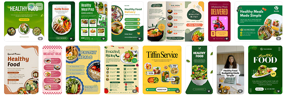
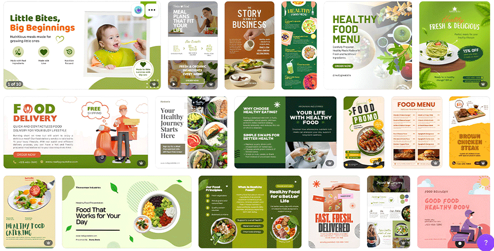
The templates covered relevant themes such as healthy eating, meal preparation, organic ingredients, food delivery, menus, and promotions. Visually, many were polished and usable as general marketing starting points.
The problem was that they did not include the FreshRoute Food name. They also did not share one consistent identity. The results moved between dark restaurant photography, bright green organic-food layouts, orange delivery promotions, pastel wellness designs, and editorial meal-plan graphics.
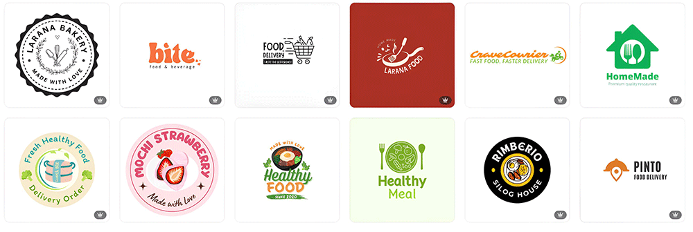
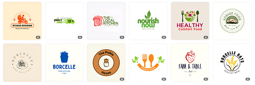
To generate logos, we had to select “Logo” separately under Canva’s category options. The resulting selection included food and delivery logos, but many retained unrelated sample names such as Healthy Meal, Nourish Now, Farm & Table, Homemade, and Vegan Food. They functioned as general templates that would still need to be selected, renamed, and coordinated manually.
This does not mean Canva lacks brand-management capabilities. Canva’s official Brand Kit can organize logos, colors, fonts, graphics, imagery, and guidelines. It can also apply approved assets inside the editor and support multiple kits for teams, clients, or campaigns. However, those features are most useful after the core brand decisions have been made. Canva’s own setup instructions begin with adding or uploading logos, colors, fonts, and other official assets.
For FreshRoute Food, those assets did not exist yet. That exposed the central difference in the test: Design.com helped establish the brand, while Canva gave us a broad workspace in which to assemble one.
Stage-one winner: Design.com
Stage Two: Could the Logo Become a Complete Brand?
Finding a logo was only the first part of the challenge. We then examined whether each platform could turn that starting point into a wider visual system.
This was where Design.com created its clearest advantage.
After processing the prompt, Design.com did not stop at showing logo thumbnails. It previewed complete sets of branded materials associated with different logo directions. These included:
One blue concept, for example, carried the same logo, cool color palette, illustration style, and typography across website, presentation, flyer, business card, and Instagram layouts. An orange direction did the same using warmer colors, circular graphic elements, and consistent headline treatment. Other options used burgundy, pale green, red, or neutral palettes while keeping each individual set internally recognizable.
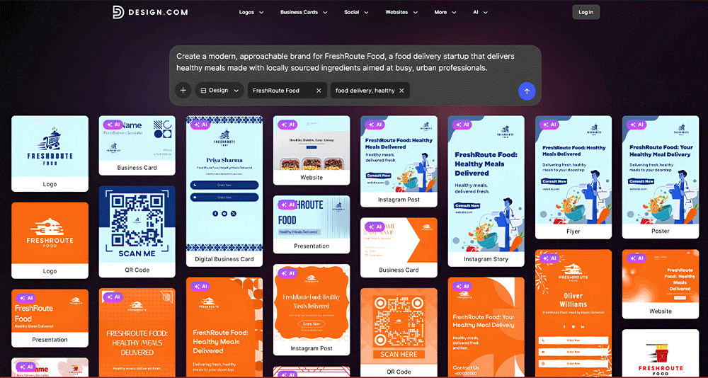
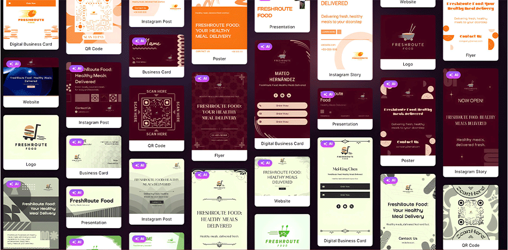
This allowed us to evaluate more than whether a logo looked appealing in isolation. We could see how it might behave as the center of a real business identity.
Canva’s first results offered a larger variety of standalone content styles, but they did not form a FreshRoute Food system. A founder could certainly select a logo, establish a palette, add chosen fonts to Brand Kit, and adapt relevant templates. The platform has the tools to complete that process. What it did not do in this zero-to-launch test was make those decisions on the founder’s behalf.
Design.com reduced the gap between “I need a brand” and “this is what my brand could look like.” Canva reduced the gap between “I have a brand” and “I need to create more content.”
Stage-two winner: Design.com
The Brand-Drift Test: Did the Assets Still Look Like the Same Company?
For this test, we treated the generated cross-asset previews as an early brand-drift stress test. The question was simple: If we placed the logo, business card, website, social post, flyer, and presentation next to each other, would they clearly belong to FreshRoute Food?
Design.com maintained recognizable visual systems
Within each Design.com direction, the brand remained identifiable across formats. Colors repeated. Logo treatments remained consistent. Typography felt related. Decorative shapes and illustration styles carried from one asset to another.
There was still variation between the different proposed identities, but that variation represented choice before selection. Once looking at one logo direction and its associated materials, the relationship between the assets was clear.
That distinction is important. Healthy-food branding frequently relies on familiar visual cues such as green palettes, leaves, bowls, vegetables, and clean sans-serif fonts. Without a system connecting those elements, one business can quickly look like several unrelated companies.
Design.com’s previews showed how each chosen identity could avoid that problem.
Canva showed greater style variation
Canva’s initial social templates were individually polished, but collectively they showed more brand drift. Several used green and cream, others used orange, brown, yellow, black, pink, blue, or photography-led layouts. Fonts ranged from bold condensed lettering to friendly rounded type and more restrained editorial styles.
That variety is one of Canva’s strengths when users need creative options. For a startup without an established identity, however, it creates a larger decision burden. The founder must determine which templates fit together, replace placeholder branding, standardize the palette, select typography, and decide which visual style should define the company.
Canva’s Brand Kit can help control this after setup through saved assets, color themes, Brand Templates, and brand controls. But in our starting-from-zero scenario, the founder had to build that foundation first.
Brand-drift winner for a new startup: Design.com
Where Did Each Platform Create Friction?
Neither experience was perfect.
Design.com’s greatest strength also created its main challenge: 10,096 logos are too many to inspect manually. Filters and a clear shortlist process are essential. Some results also missed parts of the brief, especially on later pages.
However, the volume was not purely superficial. Relevant ideas continued to appear deep into the results, and the platform gave us several distinct ways to position FreshRoute Food.
Canva had the opposite problem. Its initial selection was easier to scan, but it did not respond to the branding task as directly. The 140-character prompt limit also required the original brief to be shortened, removing some context about the audience and ingredients.
The first Canva output felt like a search for food-marketing content. The Design.com output felt like a search for FreshRoute Food’s identity.
Canva provides more freedom once a user enters the editor. That is valuable for marketers and users who want to control every layout. For a founder attempting to make coherent design choices without an established brand, that freedom can also mean more work.
Which Platform Should Startups Choose?
The answer depends on what the startup already has.
|
Startup situation
|
Better choice
|
Why
|
|
Only has a name and business idea
|
Design.com
|
Generates logo directions and matching assets immediately
|
|
Needs to launch without a designer
|
Design.com
|
Requires fewer independent branding decisions
|
|
Wants to compare many logo concepts
|
Design.com
|
Produced more than 10,000 results in this test
|
|
Needs to visualize a complete identity
|
Design.com
|
Previewed logos across business and marketing materials
|
|
Already has professional brand guidelines
|
Canva
|
Stronger fit for uploading and organizing existing assets
|
|
Produces social content frequently
|
Canva
|
Broad template ecosystem and flexible editor
|
Final Verdict: Design.com or Canva for a Startup Brand Kit?
Design.com won our FreshRoute Food test because it solved the first and most difficult branding problem: deciding what the startup should look like.
It generated 10,096 named logo options within seconds and immediately showed how several directions could translate across websites, business cards, social posts, presentations, flyers, posters, QR codes, and digital business cards. This made it easier to judge each logo as part of a complete identity rather than as an isolated graphic.
Canva produced attractive food-related templates quickly, but the initial results did not include the FreshRoute Food name or establish a consistent identity. We had to request logos separately, and the generated logo templates still required renaming, selection, and manual coordination.
For startups that already have a finalized logo, color palette, typography, and guidelines, Canva may be the stronger long-term content workspace. Its Brand Kit is designed to organize approved brand elements and help teams apply them across future designs.
FreshRoute Food did not have any of those elements at the beginning of the test. Design.com was better suited to that blank-page moment.
Overall winner for founders creating a startup brand from scratch: Design.com.
Read more about branding and design here:
Written by DesignCrowd on Monday, October 5, 2026
DesignCrowd is an online marketplace providing logo, website, print and graphic design services by providing access to freelance graphic designers and design studios around the world.
