Nowadays, plenty of businesses start with a DIY logo they created themselves using a logo maker — there’s nothing wrong with that. AI has made logo design more accessible to people with no design experience or the budget to hire professional designers. The real question now is when to redesign a logo once your business has grown past what it can do for you.
DIY Logo vs Professional Logo: What's the Difference?
A DIY logo is fast and affordable, but it has limitations in terms of originality, customization, and file formats. Meanwhile, a professional logo is designed based on a specific business strategy and given to you as a complete, production-ready file set.
|
DIY Logo
|
Professional Logo
|
|
Fast to create
|
Built around business strategy
|
|
Budget-friendly
|
Expensive
|
|
Limited file formats
|
Complete production-ready files
|
|
Template-based
|
Greater originality and custom concepts
|
|
Suitable for early validation
|
Built for long-term brand growth
|
While it’s true that professional logos may look more polished and intentional than DIY logos, the core difference lies in the process. When you create a DIY logo, you can either start with a template or provide a prompt to an AI logo generator and wait for it to generate designs. On the other hand, a professional designer starts by learning about your audience, competitors, and goals before getting started.
Why DIY Logos Are a Smart Starting Point
A DIY logo is a more practical choice for businesses that are launching fast, testing new ideas, and operating on a limited budget. It’s sufficient to help you establish your initial brand identity. During this time, speed is more important than a polished logo, so investing five figures in professional branding may not be a smart move.
Meanwhile, a DIY logo can get your brand off the ground for only a fraction of the cost of a professional logo. Many top logo design apps offer free versions of their platforms, letting you create logos for free. Not every new business needs custom branding on day one, and there's no reason to feel behind if that's where you are right now.
6 Practical Signs Your Logo Has Outgrown DIY Design
Below is a list of six signs your logo needs a redesign. This can help you check your logo against where your business actually is. If you look at each of them, you’ll notice they’re mostly functional signals rather than aesthetic ones.
1. Your business has expanded beyond its original audience
Different audiences have different expectations of your products and services and how your brand looks. Your logo may have been effective when you were only selling to your local community. However, once your business starts catering nationally, your logo may not be received well. This is also the case if you’re a B2C business shifting to B2B or a small-time hobby shop growing into a full-time company.
2. Your logo doesn’t stand out from your competitors
Most AI logo makers offer template-based logos and generic stock icons. While these platforms allow you to customize them, the editing tools are often made to be simple so beginners can use them. Hence, you can only do so much.
In addition, other businesses — including your competitors — have access to the same tools as you do. As a result, you may end up with a DIY logo that looks similar to others. It makes your brand harder to differentiate, especially when you’re competing in a bigger market.
3. Your logo doesn’t work across different sizes
Your DIY logo that looks perfect on your website and social media platforms may fall apart when printed on billboards or converted to favicons. They may be too small — so they look pixelated when stretched — or your fonts and icons may be too detailed if they’re scaled too small.
Testing how an image performs in different sizes is important when designing a logo. Still, it’s understandable if you didn’t do this intensively when you were just starting, believing you wouldn’t need all that. However, as your business grows, you’ll realize you’ll need to use your logo on more branding materials to capture more attention.
4. Your business offers more than it used to
When you started, you probably offered one to two products and services. As you grow, you may have added more to your list. Thus, the DIY logo you started with may no longer be visually accurate to your business. While your logo doesn’t have to itemize everything you offer, it should still represent what the brand has become.
5. You're investing more in marketing.
Investing more in marketing means there’ll be paid advertising, PR, partnerships, investor presentations, and sales materials. These will put your logo in front of many people. With this much exposure, it’s essential to have a more consistent, well-prepared branding.
6. You're preparing physical marketing materials.
Nowadays, with the rise of websites like Shopify and Etsy, most businesses are launched and operated online. Hence, your logo is exclusively used online on your online shops, websites, and social media profiles. Digital applications of your logo rarely emphasize its flaws. The same thing cannot be said for print.
The moment you start producing signage, flyers, posters, branded packaging, promotional merchandise, or even business cards, your logo’s weaknesses will become obvious instantly. Logo colors are usually the issue here because of RGB and CMYK differences.
RGB and CMYK are color models used for color reproduction, digital imaging, and printing. RGB (Red, Green, Blue) is the standard for digital displays, while CMYK (Cyan, Magenta, Yellow, Black) is used for printing. If your DIY logo is designed in RGB only, its colors can shift once printed. So, professional designers can provide you with both versions of your logo to avoid this.
Logo Refresh vs Logo Redesign vs Full Rebrand
The terms “refresh,” “redesign,” and “rebrand” are often used with logo design. Oftentimes, they get used interchangeably, but they actually describe different levels of change. Here’s how to differentiate the three of them.
|
Logo Refresh
|
Logo Redesign
|
Full Rebrand
|
|
What It Is
|
Making small refinements on an existing logo
|
Creating a new logo built from an existing logo
|
Building a full new identity due to market change, merger, major repositioning, reputation issue, new business model
|
|
What It Involves
|
Font tweaks, color adjustments, cleaner icon, better spacing
|
New icon, modernized typography, improved scalability
|
New positioning, messaging, visual identity, and a shift in brand personality
|
|
What happens
|
Logo stays recognizable
|
Logo still carries the brand equity of the original
|
New visual and strategic identity
|
|
Where It Fits Best
|
If your logo is dated
|
If your logo no longer fits your audience
|
If your business has significantly changed
|
How to Upgrade a DIY Logo Without Losing Brand Recognition
A logo that changes a lot in a quick span of time — whether DIY or professionally made — is at risk of looking like an entirely different brand rather than just simply leveling up. Remember that your goal is continuity. Keep the elements that still work for you while introducing new ones.
Before you upgrade a DIY logo, identify the things you’d like to carry over. Usually, these are the things that your loyal customers have become accustomed to. These include:
- Primary brand color
- Core icon or symbol
- General shape or silhouette
- Typography style
- Overall proportions
Next, launch your redesigned logo and slowly roll out new versions of your website, social media profiles, packaging, and printed materials. This gives your existing customers time to connect with the new version of your brand.
Checking ownership and licensing
If you have already determined the design elements that you’d like to keep, check if you’re allowed to reuse them. Keep in mind that templates, fonts, stock icons, and even AI-generated assets may come with different license terms depending on the design platform you have used. Not everything you made inside an AI logo maker is automatically yours, so you can’t freely transfer them into a custom design.
Ownership is also different from trademark registration. Using a logo in your business doesn’t automatically protect it everywhere. For instance, in the U.S., you also need to register the trademark before you can get full legal protection. Because of that distinction, it’s important to consult with a legal professional — not with your designer — about trademark registration and legal clearance.
Understanding Logo File Types Before You Upgrade
Logos usually come in different file types. Most logo makers provide JPG and PNG by default while holding the SVG back until you pay for a subscription. Knowing the differences between the common logo file formats is essential, so you’ll know which versions of your logo you need when creating new branded materials. This ensures they’ll be applied at their highest quality.
Vector files vs. raster files
Logo file formats can be classified into two categories — vector and raster. Vector files (SVG, EPS, PDF) are built from mathematical shapes rather than pixels, enabling them to scale in different sizes without losing quality. Meanwhile, raster files (JPG, PNG) are made of pixels, which causes them to blur or pixelate when enlarged.
|
File
|
What It Is
|
Typical Uses
|
|
Vector Files
|
|
SVG
|
An infinitely scalable vector file that stays sharp at any size
|
Websites, apps
|
|
EPS
|
A professional vector format built for print production
|
Signage, large-format print
|
|
PDF
|
A universal format most printers and vendors can open
|
Sharing with printers
|
|
Raster Files
|
|
PNG
|
A raster (pixel-based) file with a transparent background
|
Digital use, overlays
|
|
JPG
|
A small, compressed raster image
|
Everyday digital use
|
The professional design brief checklist
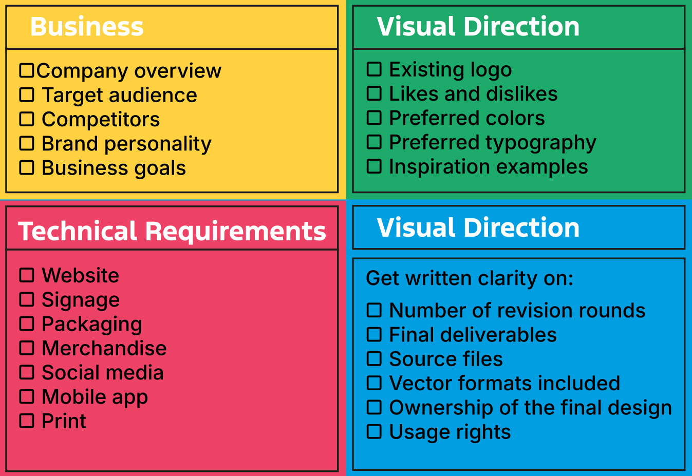
When you decide to upgrade a DIY logo, prepare a specific brief your designer can use as a guide. This works far better than providing them vague instructions like “make the logo more modern,” which can produce outputs that are way off from your desired look and result in numerous rounds of revisions.
Meanwhile, having a clear brief saves time and avoids miscommunication. There’s a greater chance that your designer may get it right the first time. Here’s a checklist to help you prepare everything you need even before you reach out to a designer and redesign your logo:
When Keeping Your Current Logo Is Actually the Better Decision
Not all businesses need to upgrade their DIY logo. It doesn’t matter if you have been using it for a while or it doesn’t fit the current trend. Sometimes, sticking to your current logo is better than getting a new one.
Keeping your DIY logo may still be the right call if:
- Your business is still testing demand and isn't ready to invest in a full brand identity yet.
- Your existing customers strongly recognize your current logo.
- Your logo still technically works across every format you need.
- Your business strategy hasn’t changed significantly.
In cases of branding issues, it’s worth checking your messaging or positioning before upgrading your logo. Sometimes, these issues aren’t caused by your visual mark.
Final Thoughts
Opting for a DIY logo during the early stages of your business can be the right decision, especially if you plan to launch your brand fast and on a limited budget. You don’t have to abandon it simply because it’s already old. The best time to upgrade a DIY logo is when it no longer serves your brand.
Once you have identified viable reasons to redesign your logo, platforms like DesignCrowd are a practical next step. They put your design brief in a pool of designers with different specialties and styles. They can provide multiple original concepts for you to compare before committing to the one that best reflects your business goals.
Written by DesignCrowd on Wednesday, November 4, 2026
DesignCrowd is an online marketplace providing logo, website, print and graphic design services by providing access to freelance graphic designers and design studios around the world.
