At first glance, some may think there is not that much difference between a logo and an icon. After all, both are used to represent something. Most consider them one and the same.
So under which category does your design project fall?
Posting a project under the right category attracts the attention of the right designers/specialists, which is why it is important to know whether you are looking for a logo or simply an icon.
| |
|
Need a logo? Why not make a logo you'll Love. Simply enter your business name and customise any of the thousands of logos generated for you.
It's FREE TO TRY!
|
|
|
| |
Let's define icons and logos, and identify their basic uses.
Icons
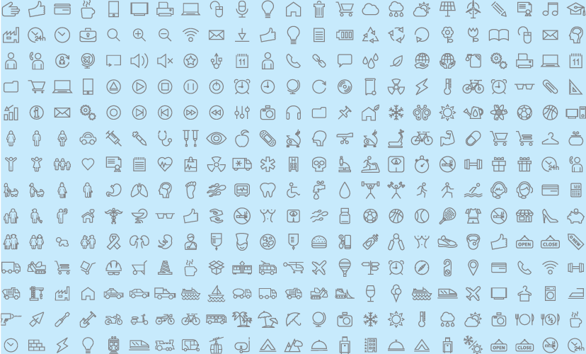
An icon directly represents (or shows us) an idea, concept, operation or action. Icons simplify or summarize an operation through a graphical representation, and relays this to the user.
Icons are commonly used in applications (or apps), to represent what the app does, and are a key element in UI/UX interface.
They are used more often for actions in responsive web design, and help the user navigate around the site - think how a house icon directs you to the homepage.
If you are looking to create a personalized icon for your website, you can find icons online to suit your individual needs.
Let's take a look at what famous icons can tell us about the typical characteristics of an icon, which makes it different to a logo.
iTunes
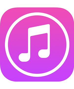
A music note icon, for example, conveys an idea that the use of the application it represents is music related. Take for example the icon used to launch iTunes:
 Itunes App Icon
Although the icon above does not have 'iTunes' written on it, first time users will have an idea that the icon represents a program that has something to do with music.
Facebook Like
This icon is easily recognized is the Facebook 'Like' icon.
The icon is made of closed fist holding a thumb up, or literally a 'thumbs up'. The gesture is usually used as a sign of approval.
 "Facebook Like Button"
In the social networking site, this icon is clicked when a user wishes to relay a message of agreement to a post or a comment, or simply 'liking' it without having to say anything. (If it were in real life, everyone would be sticking their thumbs up all the time).
To make it more recognizable, it utilizes only two colors: blue and white which are also found on Facebook's logo.
Dropbox
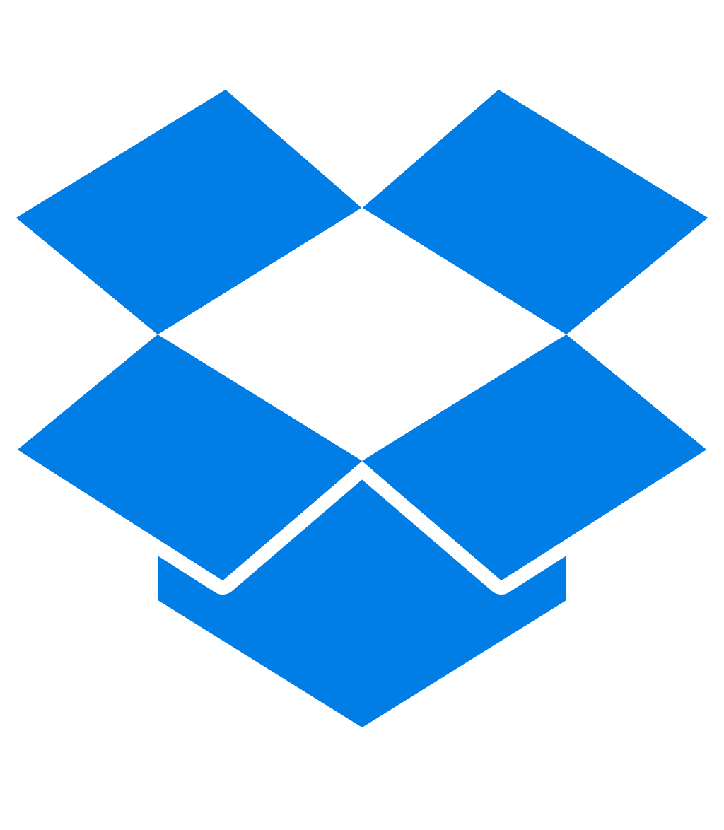
Another great example is the icon for the file hosting service, DropBox. The icon is basically an open box, in light blue which basically entices the user to just drop their files in the box and they can carry and access it from anywhere.
 Dropbox App Icon
If you have DropBox installed on your computer, this is the icon you need to look for and click to access your files. The icon is integrated in the DropBox logo.
Hamburger menu
The hamburger is an icon that is popularly used for the navigation bar on a website. It's mostly used in responsive design, where websites cater to smaller devices and screen sizes.
It replaces the typical navigation bar due to the space requirements, and is one of the trends for 2016.
 Hamburger Menu
 Hamburger Menu in Made In Haus
Icons on websites
An icons don't always need to be an active button for webdesign, it can also be a design element that explains what a brand is promoting.
Icons work on websites to illustrate what the company is about. For example, mixpanel highlights its business areas of navigation, search, mail, media, and analytics, through the use of recognizable icons.
Icons used in Mixpanel
 Icons used in mixpanel
Key Points
Icons are visual descriptors of function. The best icons find a visual metaphor - thumbs up, empty open box or a musical note to convey the primary function of the application or the object.
Logos
A logo is a recognizable symbol primarily used to represent a business or an organization. Its representation of the organization may be direct, hidden, or abstract. A logo must be immediately associated with the organization it represents. It taps into the organisation's mind set and public image, its values, and is a graphical summary of the company 'brand'.
According to justcreative.com, an effective logo should be simple, memorable, timeless, versatile, and appropriate.
Logos can be a logomark, a logotype, or a combination.
Let's kick off with some examples.
Mastercard
MasterCard's logo represents the brand through the use of colors and the logomark. It wouldn't work as an icon, as the combination of two circles tells the audience nothing about the company's service as a money card system.
 Logo Combination - MasterCard
Coca-Cola
The Coca-Cola logo is timeless and memorable. How good is this logo? People would associate the typeface, the strokes and the color with the company, even if the name is changed. It carries with it brand heritage as it has been the company's logo since 1885.
 Logotype - Coke
Google
Although this logo has evolved over the years, it is still instantly recognizable. People associate with the unique, branded colors, and stylistic elements of the typography. It can stand alone to represent so much about the brand.
 Logotype - Google
Apple
A timeless silhouette logo, the design has evolved to remove the wording underneath the mark. Despite its simple appearance, it is not an icon, as it does not speak to the brand's service or actions.
 Logomark - Apple
McDonalds
The goldern arches are iconic of the brand, but are not an icon. The logomark is timeless and instantly illustrative of the brand, but not the actions it performs.
 Logomark - McDonalds
Let's Get Technical...
To give us a clearer picture of the difference between a logo and an icon, we need to dive deeper into the technical characteristics.
Shape
There aren't really shape requirements for icons, but if it's an app icon for an organisation, it should fit into a square, (i.e. it should be 'quadratic').
 Icons on Phone Devices
Icons don't come with many technical requirements, and as they can represent an action on a website, they can be any size. The designer should consider the proportions however, and how it will sit in the context among other elements. The final design itself can be a filled our our outlined.
 Different Styles of Icons
While logos do not have dimension restrictions. They can be quadratic too. Because of this, logo designs allow more creativity in contrast to icon designs.
Size
Icons shouldn't ever lost their quality when viewed on different screens. They should be crated as vectors using programs such as Adobe Illustrator to ensure they won't look soft or blurry if resized.
When creating icons for a specific brand, be sure to keep them consistent so they confirm to the same hierarchy when used in context.
 Icon Set
Multi-purpose and Multi-media
Logos are also vector based, and can be scaled into any size without losing quality since they also need to be used in different materials related to the organization it represents such as brochures, business cards, website, banner, signage etc.
Conclusion
Although some logos use an icon to make it more distinguishable, icons are logos are completely different based on the technical aspects alone.
If you find yourself confusing an icon for a logo and vice versa, always ask yourself what you need the design for, and never forget to consider the technical requirements.
By Cherished Alegroso (DesignCrowd Customer Support Super-Star and blogger at Love Liverspread)
Want More?
Discover how to make the best use of design:
The Top Web Design Trends Set To Dominate 2016
When Should You Consider A Rebrand For Your Business?
App Or Responsive Website? What Does Your Business Really Need?

Written by DesignCrowd on Monday, March 21, 2016
DesignCrowd is an online marketplace providing logo, website, print and graphic design services by providing access to freelance graphic designers and design studios around the world.
